ForumsNewsPreview of New Notes Section
Preview of New Notes Section
| Author | Message |
|---|---|
|
Jake Toodledo Founder |
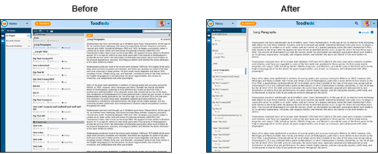
Today we are turning on a preview of our new Notes section. Toodledo Notes has been completely rewritten from the ground up with a number of improvements.
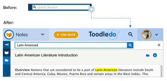
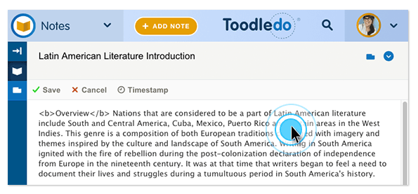
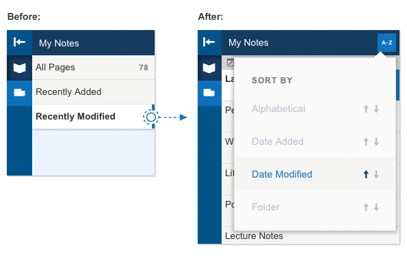
Preview it here: notes.toodledo.com During the preview, the old Notes section will still be the default, but you can choose to switch to the new version and use it whenever you want. 1) The Notes section is now responsive, which means that it works regardless of the size of your screen. So, if you use Notes from your phone's web browser, it will work great without needing to pinch and zoom. If you are using Toodledo on a desktop computer, you can make the browser skinny and keep a note on the side of your screen for reference. 2) We have streamlined the interface which has given us the ability to use more of the screen for displaying your note, the thing that matters. And you an collapse the sidebar to get a full screen view of you note.  3) Search has been improved. When you do a search, it will more quickly find all the matching notes, and even highlight the matching words that it found inside the note.  4) When you want to edit a Note, you no longer need to click an "Edit" button to begin. Now, you just click the note and it will automatically enter edit mode with the cursor at the location that you clicked. The "Save" and "Cancel" buttons are in the same place, but look a little different. The "Insert Timestamp" button has been moved from the bottom of the note to the top.  5) Moving a Note to a different folder is a little different now. To do it, click the folder icon at the top of the note to reveal the "Info Drawer". Then click the current folder and a menu will appear to select another folder. This may seem a little cumbersome right now, but it will make more sense in the future when a Note can have other attributes, such as tags. Also, it matches how Lists and Outlines work, so it will be familiar if you use those sections. 6) The toolbar has been cleaned up and rearranged a bit. The sort button is in roughly the same place. The print and delete buttons have been moved to the Action menu on the right side. The search bar has been moved to the top of the page and turned into a search button (magnifying glass icon). The "Collapse All Dividers" button has been removed, but the functionality still exists in a different form. Now, if you double click any of the dividers, they will all close or open. 7) The "Recently Added" and "Recently Modified" shortcuts have been removed. The new way to find your recent notes is to sort your notes by date. For example, if you want to view your recently modified notes, you would sort by "date modified" and your recent ones will be at the top. This new method takes 1 extra click, but this sacrifice in speed allowed us to make viewing your "all notes" list 1 click faster, as well as simplifying the page to give more area to the note. So, we feel that this is a worthwhile compromise. Our beta testers didn't seem to mind, so hopefully this will be ok. We'll see in the comments.  8) We added a "Duplicate Note" feature so you can quickly make a copy of a note. 9) We've improved the keyboard shortcuts for those people who like to use them to be more efficient. 10) Printing has been improved 11) All this work lays the foundation for future improvements that people have been asking for. For example: Rich text formatting, sharing notes, encryption of data, offline support and more. We've been testing this for several weeks with our alpha and beta testers and we've gotten a lot of positive feedback. We think that we've fixed all the bugs, but there is probably something that we've missed, so we'll be monitoring the forums and tickets carefully and fixing bugs quickly as they are discovered. Please let us know what you think. This message was edited Mar 17, 2016. |
|
matanln |
I totally dig this new layout!
|
|
Salgud |
Nice enhancements! Looks a little better, more consistent with the other features. Not having the Edit button a plus, always wondered why we had to do that. Thanks!
|
|
pawelkaleta |
Works good, nice job!
One of my suggestions reported during beta is still not implemented (if you click on "+ Add Note" button, the text "New note" in the title field needs to me manually removed each time (Chrome browser). It would be better if it behaves like "Quick Add Task" text in the Task section, i.e. the text disappears after clicking on the quick add task field. |
|
BobGott |
Great step forward .. I really like the sort feature ... BUT ... I'm still ever-so waiting for rich text (I did read that its in the works)
|
|
FHE-IV |
I like it as well. I do have some very lengthy notes and I like that there is enough character capacity as such. The issue that I hope you can improve is printing of a lengthy note. The note is cut off if longer than an 8.5 x 11 paper. In fact, there is not even a page two etc. It would be very helpful if you could assist with this issue.
Thanks, you all are doing a great job! |
|
Jake Toodledo Founder |
@FHE-IV Can you please tell us which web browser you are using? When we print a long note, it prints the whole thing on multiple pages.
|
|
UbuRex |
Love the changes.... I know it's a different team, but I hope there's some possibility that the improved editing and improved searching capabilities that you've introduced here...will find their way to the iOS application: note editing and searching are both notably weak in the current iOS app. Thanks for considering!
|
|
castiron |
I like the new layout, and I definitely like the increased ease of editing.
One unexpected behavior: When I try to switch from the new view of Notes back to Tasks, it's opening a new tab instead of switching back to Tasks in the initial tab. So my pinned tab for Toodledo that I usually keep set on Tasks is now stuck on Notes. (OSX, Firefox 44.0.2.) |
|
Ralph Owens |
Love the new layout. Job well done!
The only addition I think would be helpful is if you could some how tie the notes section of a task back to a note in this section. This way as we are editing tasks we could click on a hyper link that ties that task to a note that has rich text editing :-) |
|
Jake Toodledo Founder |
@Ralph Owens: With a subscription you can attach a note to a task and do exactly what you are describing.
|
|
nighthawk59 |
Hi! Unless I'm doing something wrong, time-stamping doesn't work for me in the new format anymore.
|
|
Evan C. |
Whoops I just read this:
11) All this work lays the foundation for future improvements that people have been asking for. For example: Rich text formatting, sharing notes, encryption of data, offline support and more. This message was edited Mar 19, 2016. |
|
James Aslan |
A URL in a note used to be displayed as a hyperlink but that's no longer the case.
|
|
oliver.trusler |
Works well, only issue is when you want to copy something out of the note. A double mouse click moves to edit mode, the screen jumps and it selects the wrong text. You then need to find the text again and copy (and ensure you don't change it by accident!).
|
|
Jake Toodledo Founder |
@nighthawk59: In what way is the timestamp not working? It seems to be working for us. What web browser are you using?
@haim_129937: URLs should still be displayed as hyperlinks. Can you make a screenshot and send it to us in a support ticket so we can see the type of url that isn't being converted for you? |
|
James Aslan |
Update:
URLs are not displayed as a hyperlink when searching for notes. To reproduce: click on the search icon then start typing. In the notes that match the search, the URLs no longer display as hyperlinks. Cancel the search and URLs display as hyperlinks again. |
|
Jake Toodledo Founder |
Yes, this is the expected behavior right now but we plan to make it possible for links to stay working while a search is active.
|
|
James Aslan |
Sounds like this is intentional.
What is the rationale for not displaying URLs as hyperlinks when search is active? |
|
nighthawk59 |
Here's what happens: I click in the body of the particular note. I get the "save, cancel and timestamp" mini toolbar. I click on the timestamp option, and the mini toolbar goes away, but no date or time is entered on the note.
This happens whether I click in the note at the very end of existing text in the note (which is my desired out come), at the beginning of the text, or in the middle of an existing sentence. The same behavior persists whether I use Chrome or MSIE (version 11 for Windows 10 - not Edge). Thanks |
You cannot reply yet
U Back to topic home
R Post a reply
To participate in these forums, you must be signed in.
